Carmen Correa en V: One Umbrella, Four Ways In
Carmen Correa, dancer, teacher and researcher, wanted to share experiences that benefit anyone emotionally, intellectually, physically and socially. First, her four workshops needed to be seen as one body of work.
The challenge
Four workshops by one dancer, each with its own name, and nothing to show they belonged together.
What we did
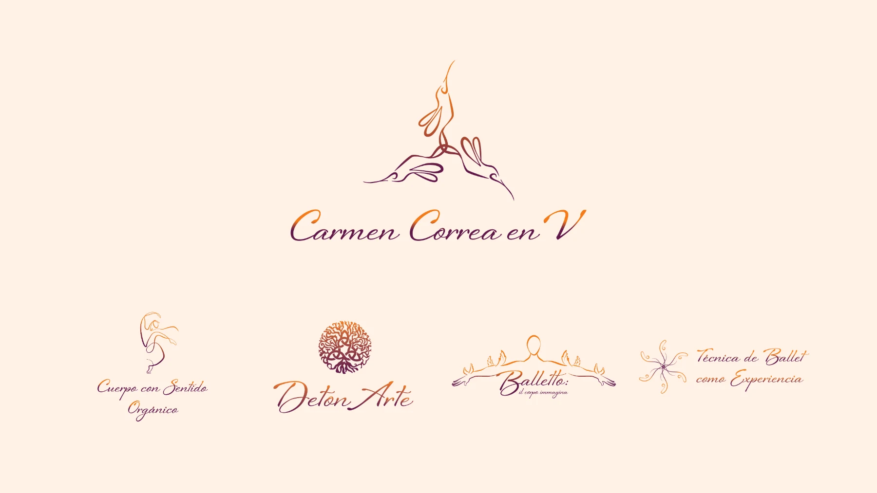
One umbrella, Carmen Correa en V. Four brands under it: Cuerpo con Sentido Orgánico, Balletto, DetonArte and Técnica de Ballet como Experiencia. A family of marks and one tagline: Detona experiencias que inspiran.
What changed
- Her DetonArte course launch, which we coached her through one on one, filled its enrollment goal.
- Her four offers now go out together, on equal footing, in one services folder and one landing page.
- Carmen still uses the identity, and new pieces keep fitting into it.
The story
Known one workshop at a time
Carmen had spent her life making experiences that move people. She danced for more than two decades with the Compañía Nacional de Danza. She teaches. She researches.
She is also our founder’s mother, so we have known her work our whole life.
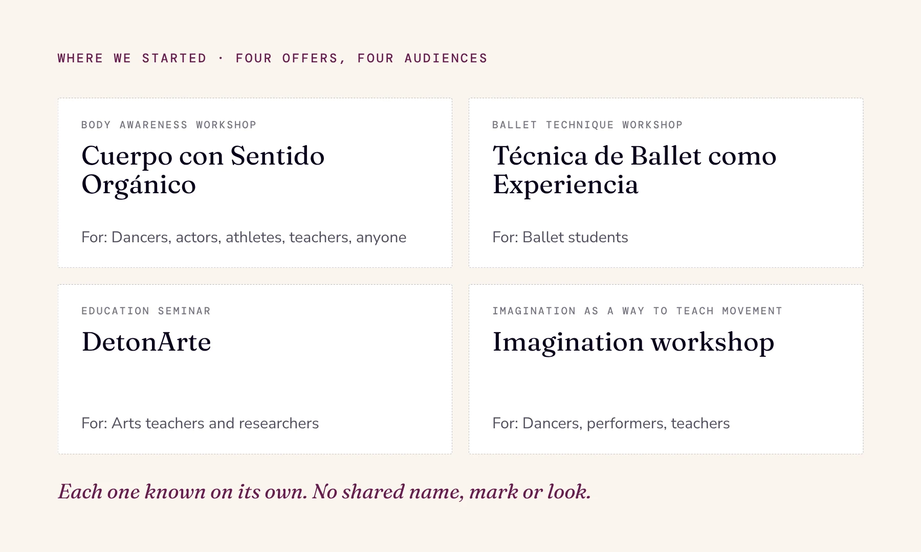
The starting point, offer by offer.
Here I am
“They know me for Cuerpo con Sentido Orgánico, they know me for DetonArte,” she told us.
She put it plainly: “I’m always waiting for them to look for me, to remember me, instead of making myself present and saying, here I am.”
The whole, through its parts
If the four offers looked unrelated, her work looked small. Flattened into one message, each would lose what made it good.
Her kickoff notes asked for one thing above all: “Define the whole... by clearly distinguishing the parts.”
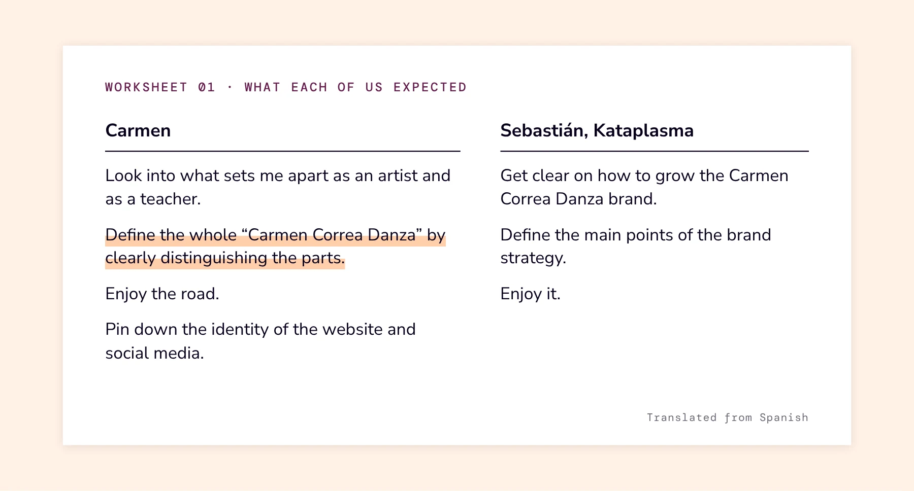
The first page of her Inspiration Strategy™.
One purpose
Line by line, we sharpened why her work exists. The third draft became her mission.
One session turned the project: every workshop is a form of that same purpose. Sell the purpose, and the four stop competing.
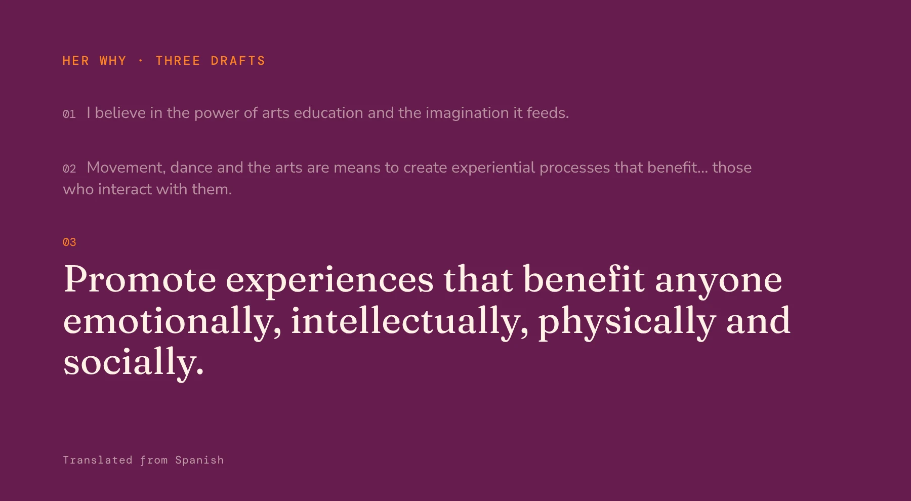
Three drafts, one mission.
Making the intangible concrete
Word by word, the x-factor worksheet moved from knowledge and experience to one idea: make the intangible concrete.
From there came the concept, Experiencia [in]tangible.
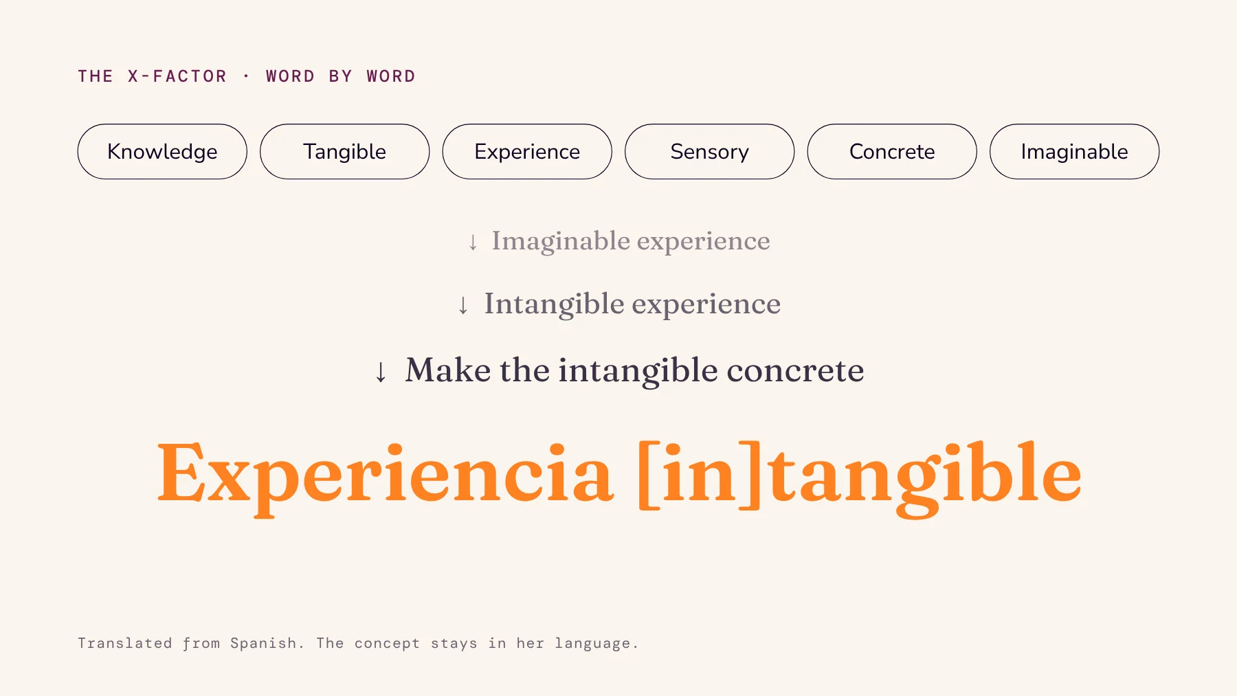
From six loose words to one concept.
What I already am
Carmen saw what it meant for her: “This is more a repositioning of myself. It’s a way of positioning what I already am.”
The concept set the feeling, the look and the shapes every mark would draw from.
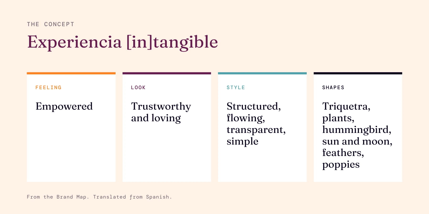
The concept, ready to brief the marks.
The family test
One mark already existed: a single line of a dancer in motion, drawn for Cuerpo con Sentido in 2018. Carmen kept it as her touchstone.
“You know me,” she told us, “I’m curvy, round, spiral.”
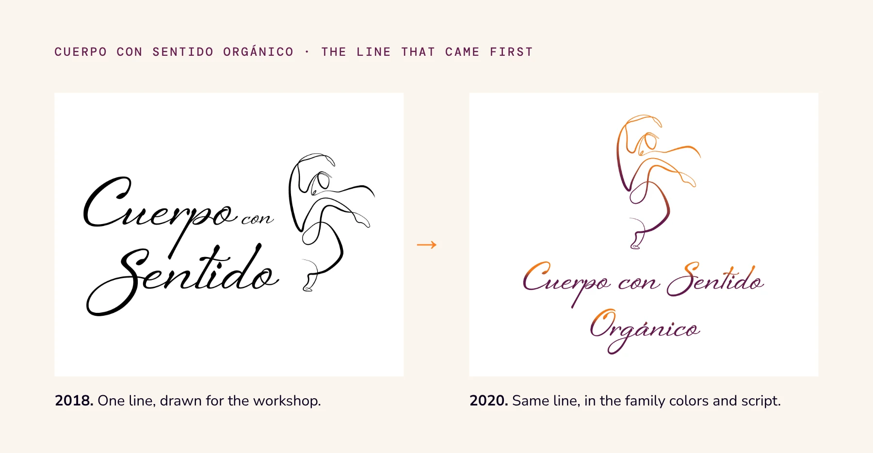
Cuerpo con Sentido Orgánico, the first mark in the family.
Could one mark hold the rest?
Carmen asked it straight: could one identity hold all the others? Yes, on two conditions: shared colors, and a family test.
Lay the marks side by side. If they look like cousins, it works.
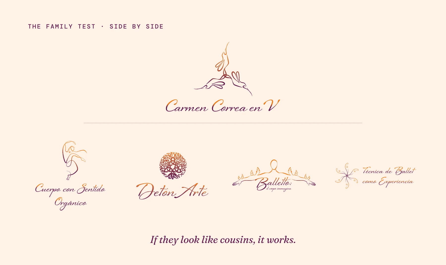
The umbrella above, the four brands below.
Three hummingbirds
The umbrella became three hummingbirds in the shape of a triquetra. For Carmen, that shape is the base of her work: the physical, the emotional and the intellectual.
She vetoed ballet slippers early. “Remember, Carmen Correa en V is not only dance.”
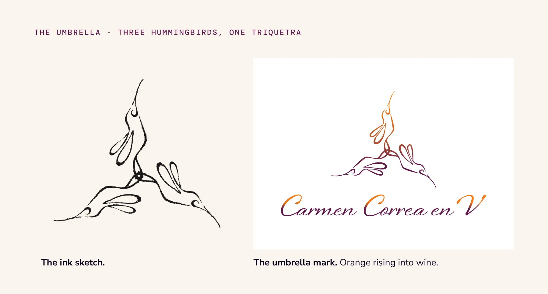
The hummingbirds, from sketch to mark.
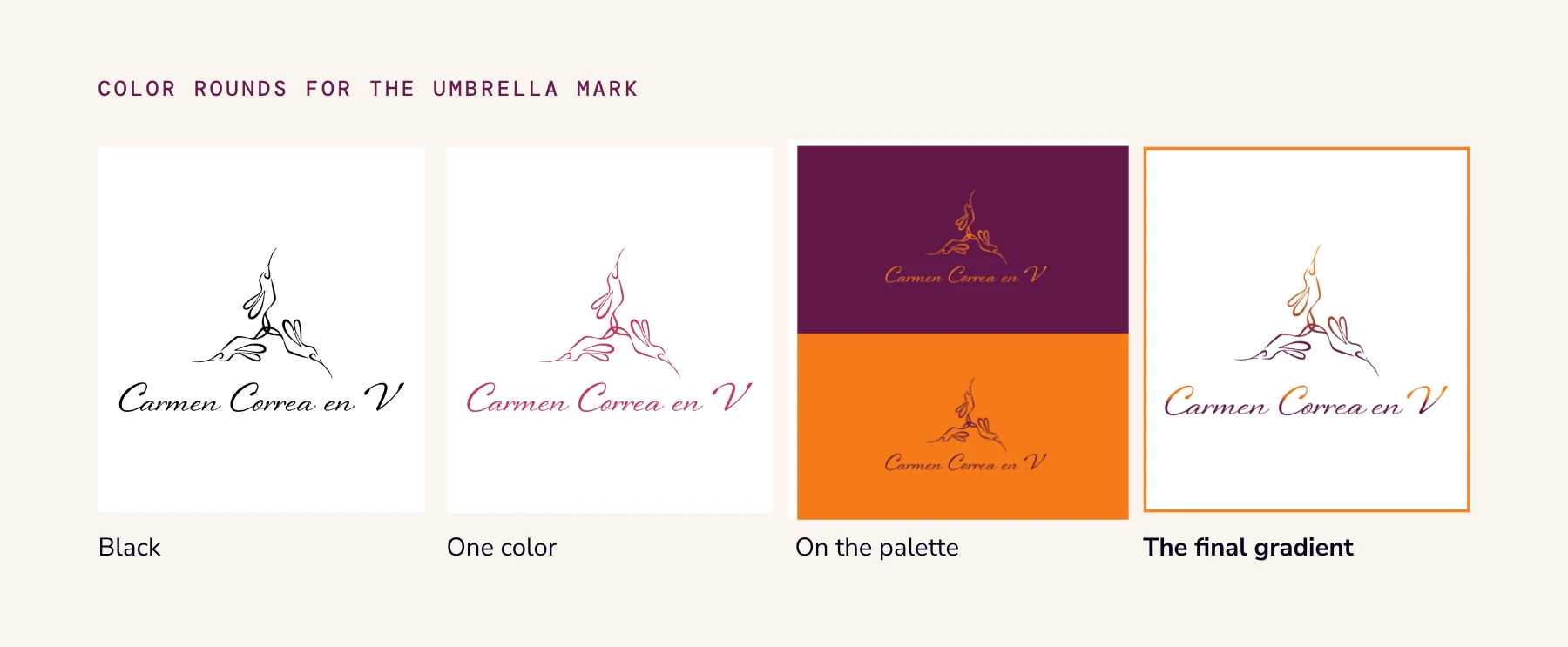
Four color rounds in four weeks.
The logo we drew and dropped
Not every good drawing joins the family. For her ballet-technique workshop we drew a dancer on pointe, holding the world.
It started from Carmen’s own pencil drawing. Her brief was a whole idea in four words: “Embrace diversity. Hold the world.”
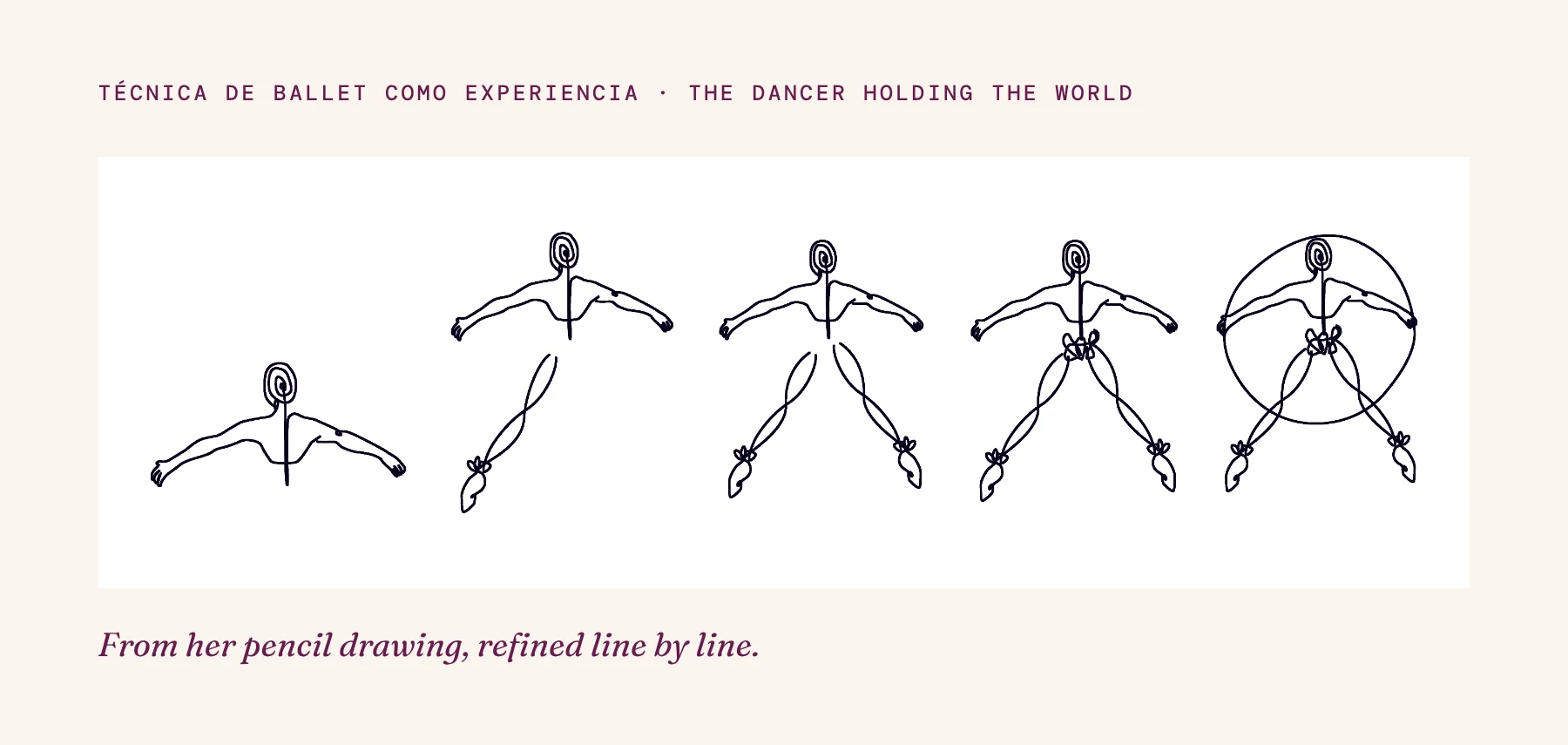
Five stages of the same dancer.
It failed the family test
It worked as an image. Next to the hummingbirds, it read as a different brand.
So we made the call together: we dropped it and kept a small flower built from pointe shoes, which fits the triquetra.
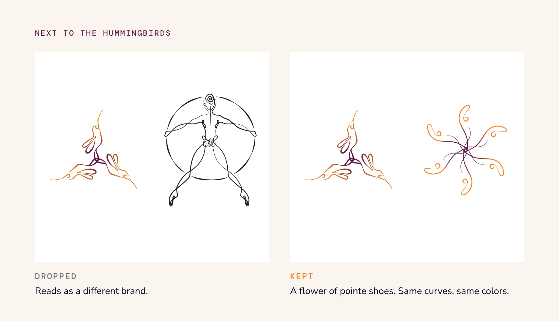
Same test, two answers.
A flower of pointe shoes
That flower became the mark of Técnica de Ballet como Experiencia.
The best logo for the family was not the best logo on its own.
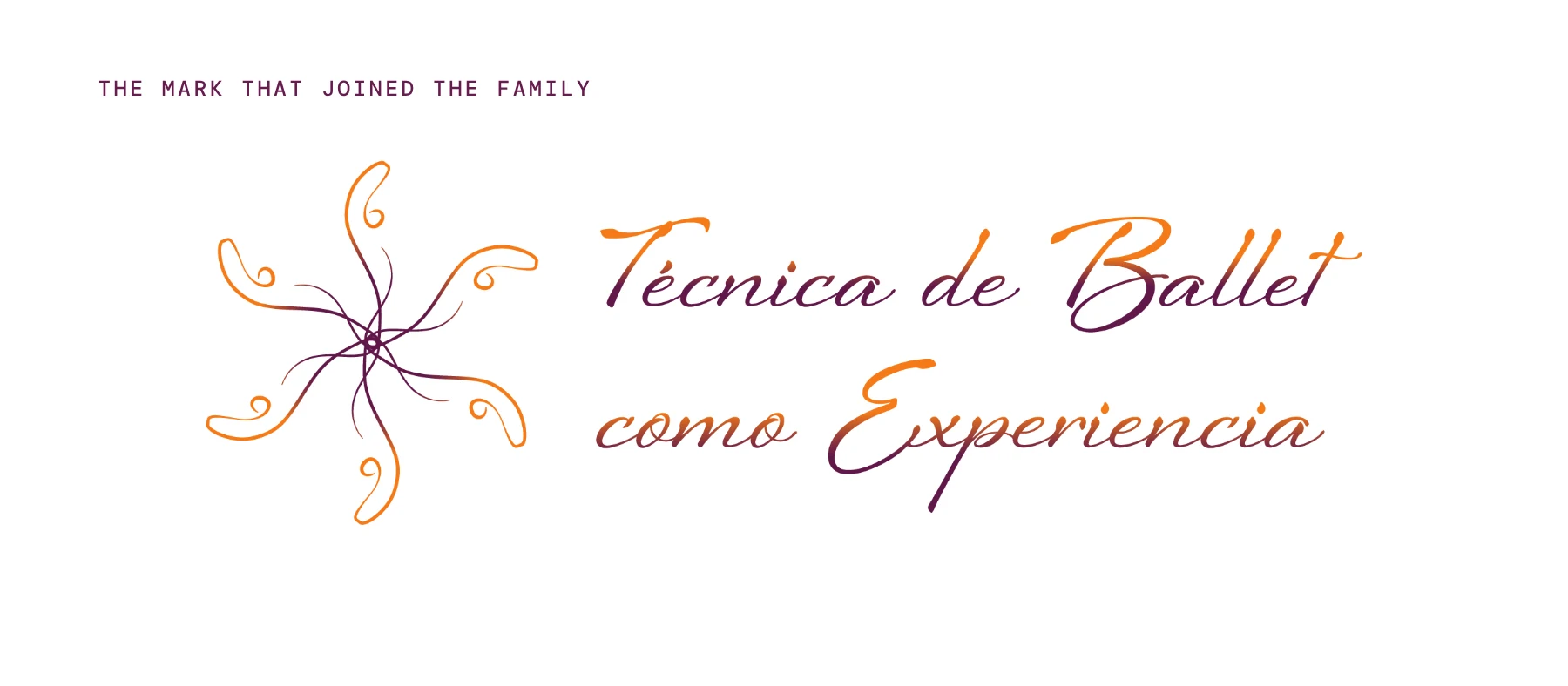
Técnica de Ballet como Experiencia, the final lockup.
The word that moved up
The tagline came from one of the sub-brands.
We started with “inspires paradigm shifts.” Carmen found it too grand.
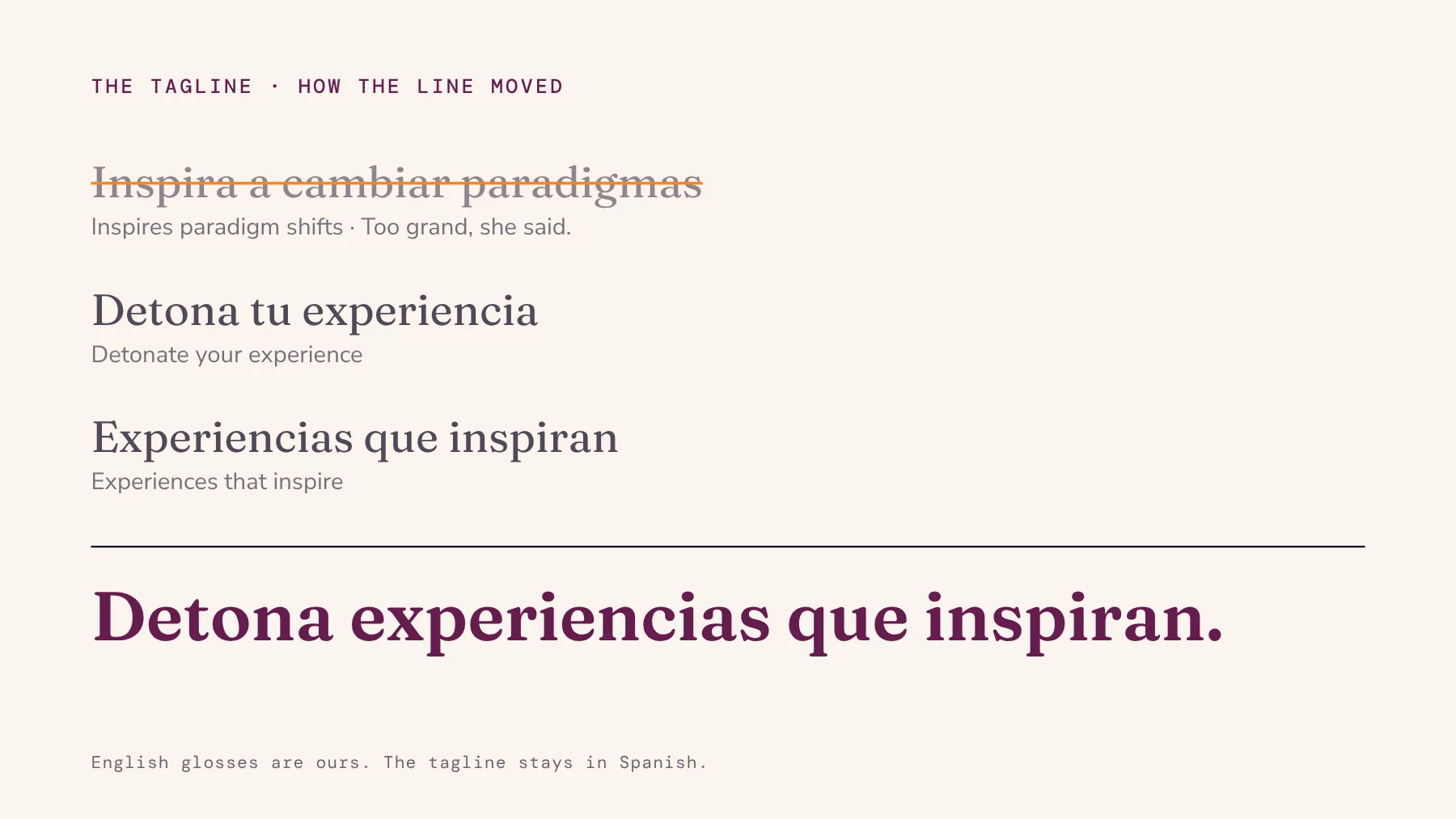
Three lines tried, one kept.
What I do is detonate
We kept going until she noticed what the word detonar, from DetonArte, was doing. It described her work everywhere, not only in the seminar.
“What I do is detonate a lot,” she said. The sub-brand’s verb moved up to the umbrella.
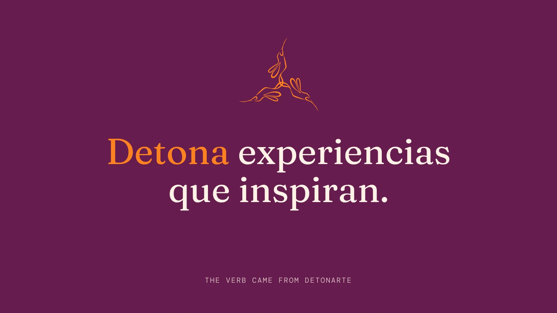
DetonArte goes first
Then the family had to work in the world. DetonArte came first.
Carmen planned the launch of her DetonArte course, and we coached her one on one through the campaign.
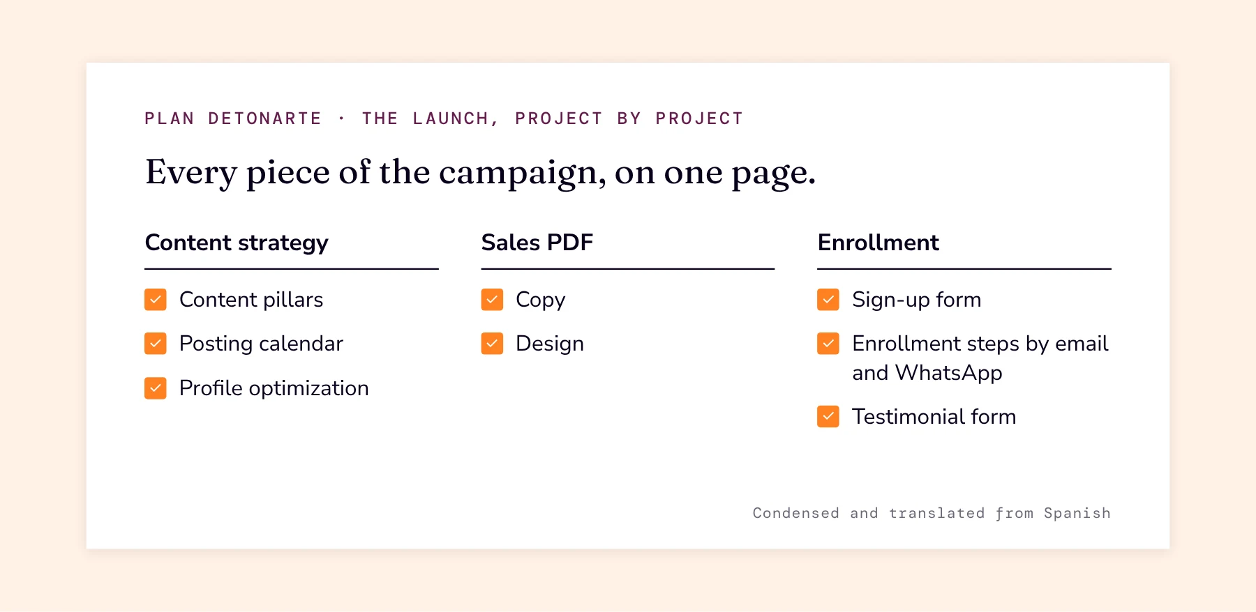
The launch plan, condensed.
The path to a seat
We mapped how a teacher would find the seminar, trust it, sign up and tell others.
Each step got its own channel and its own goal.
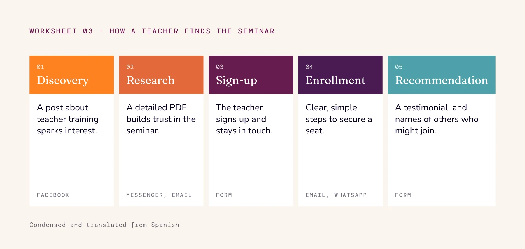
Five steps, from a first post to a referral.
The seminar's story
Her seminar’s story put the teacher at the center: four steps from what they already know to their own teaching model.
Every step pointed at the same change: from frustrated and limited to recognized and empowered.
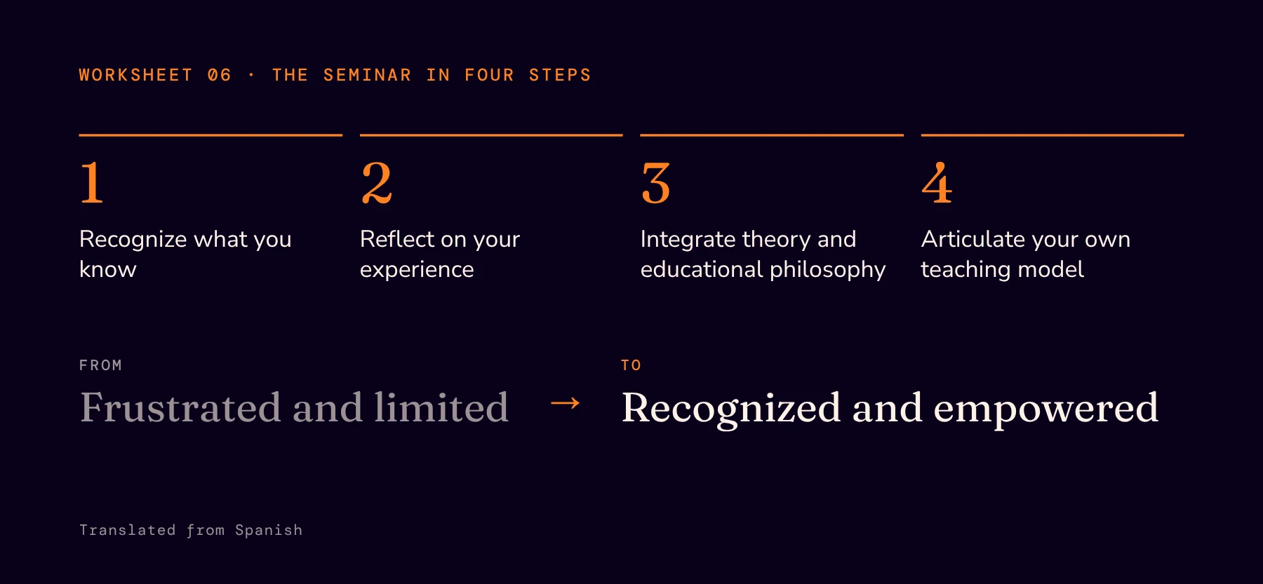
The seminar, as Carmen told it.
Four ways in
The other offers now travel together. One services folder and one landing page present all four on equal footing, each with its own voice.
One umbrella holds them, tied by one palette, one script and one line drawn from nature.
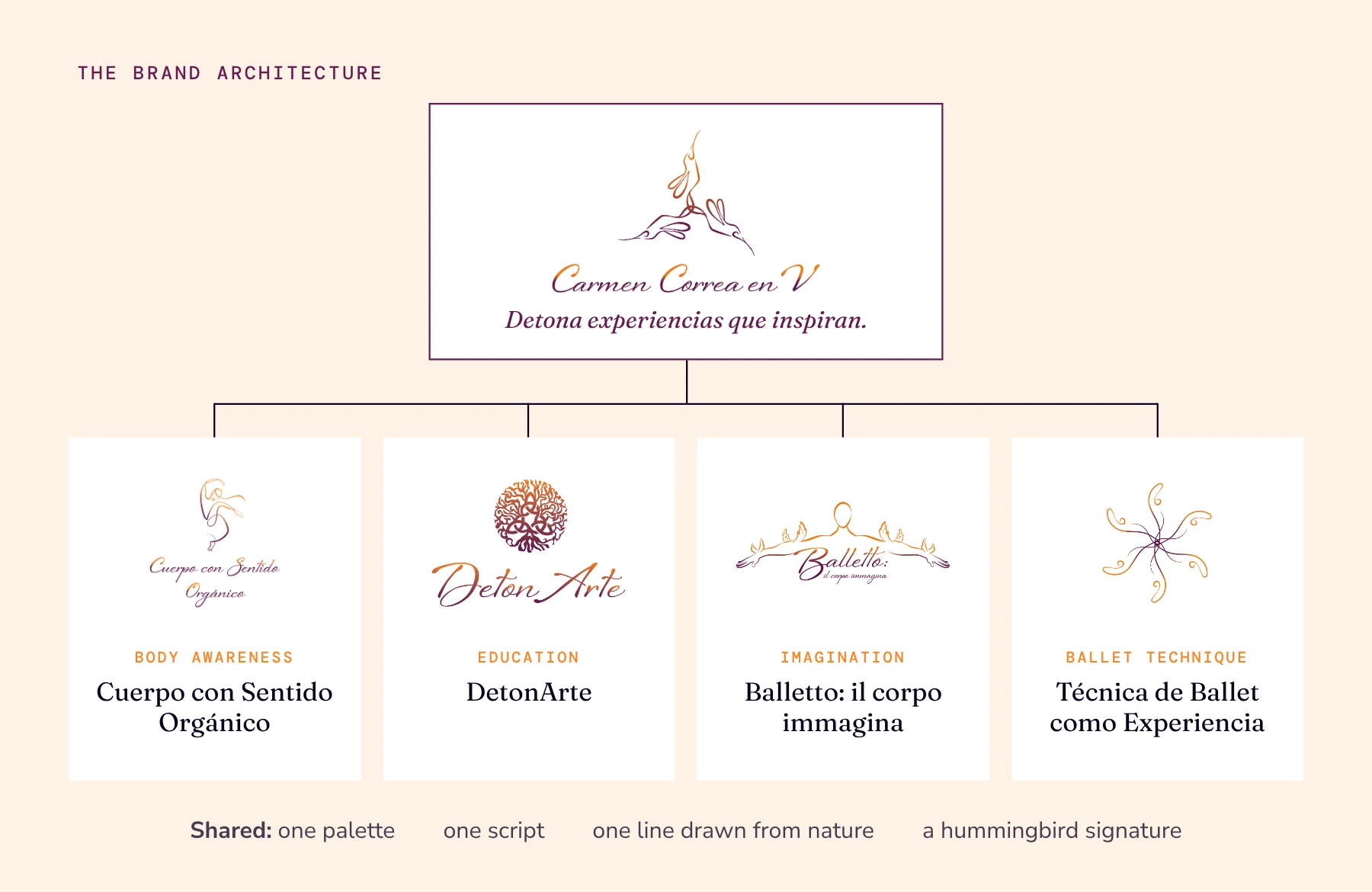
One umbrella, four brands.
DetonArte
Education. A tree grown from the triquetra, its roots and branches woven into “a very organic network.”
We set the word upright and dropped the subtitle. A logo has one job: to be recognized.
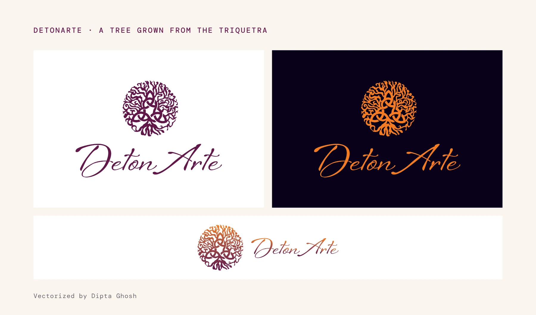
DetonArte in wine, in orange and in its horizontal version.
Balletto: il corpo immagina
Imagination. Drawn from Francesco Orazzini’s figure, arms lifted like little wings.
We left the torso open. Seeing it, Carmen said: “What you did by removing that part is exactly opening a universe.”
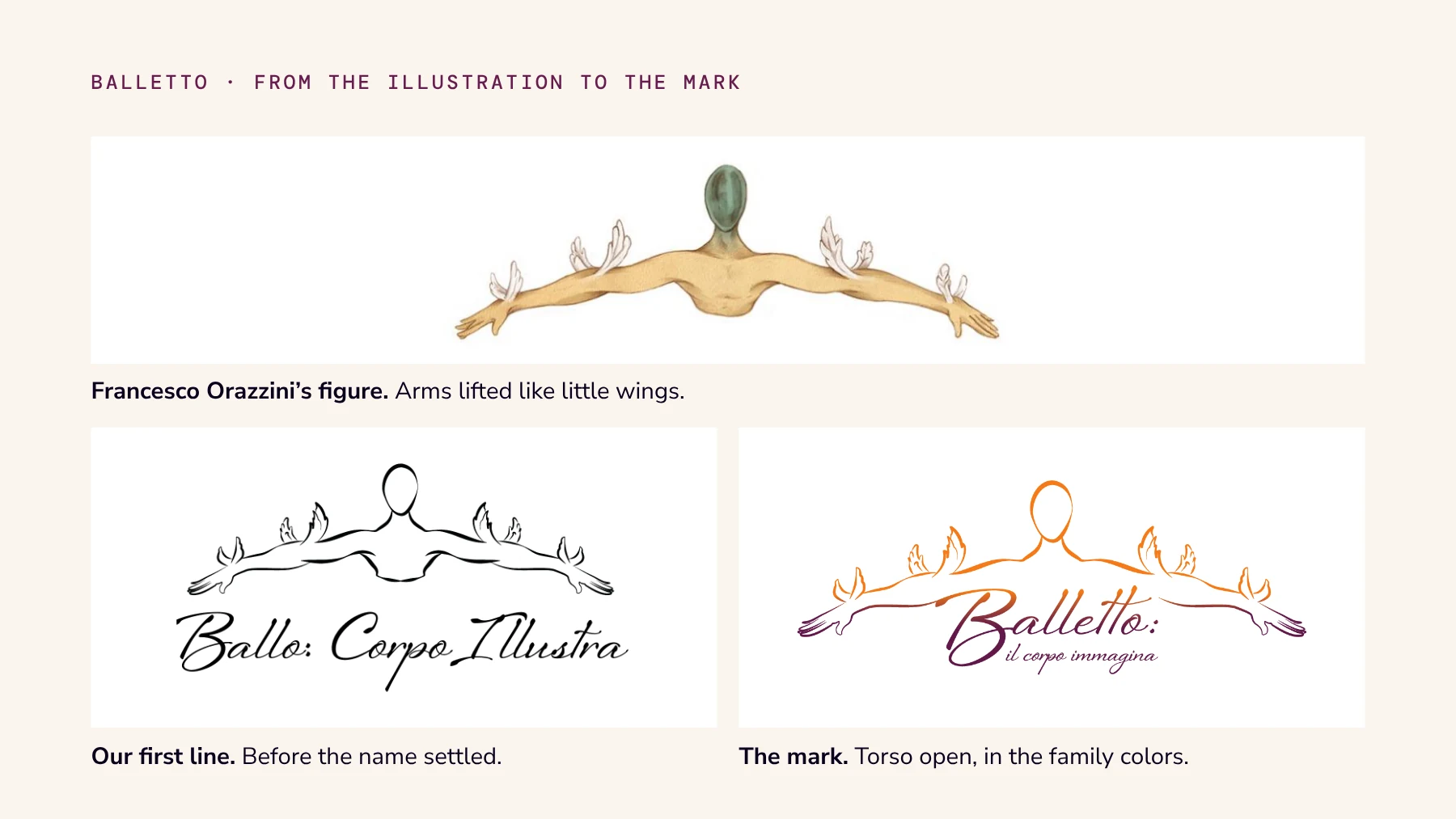
Illustration by Francesco Orazzini, mark by Kataplasma.
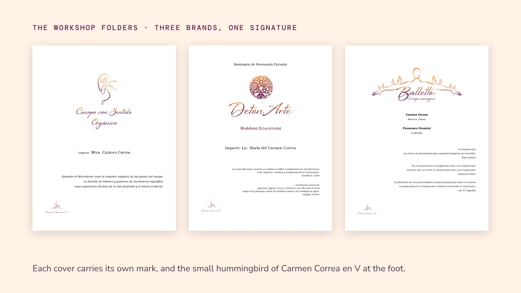
The 2024 folders for Cuerpo con Sentido Orgánico, DetonArte and Balletto.
One system
Every application sheet we delivered lists the same four colors and the same script.
Every mark comes in orange and in wine, in a full and a reduced version.
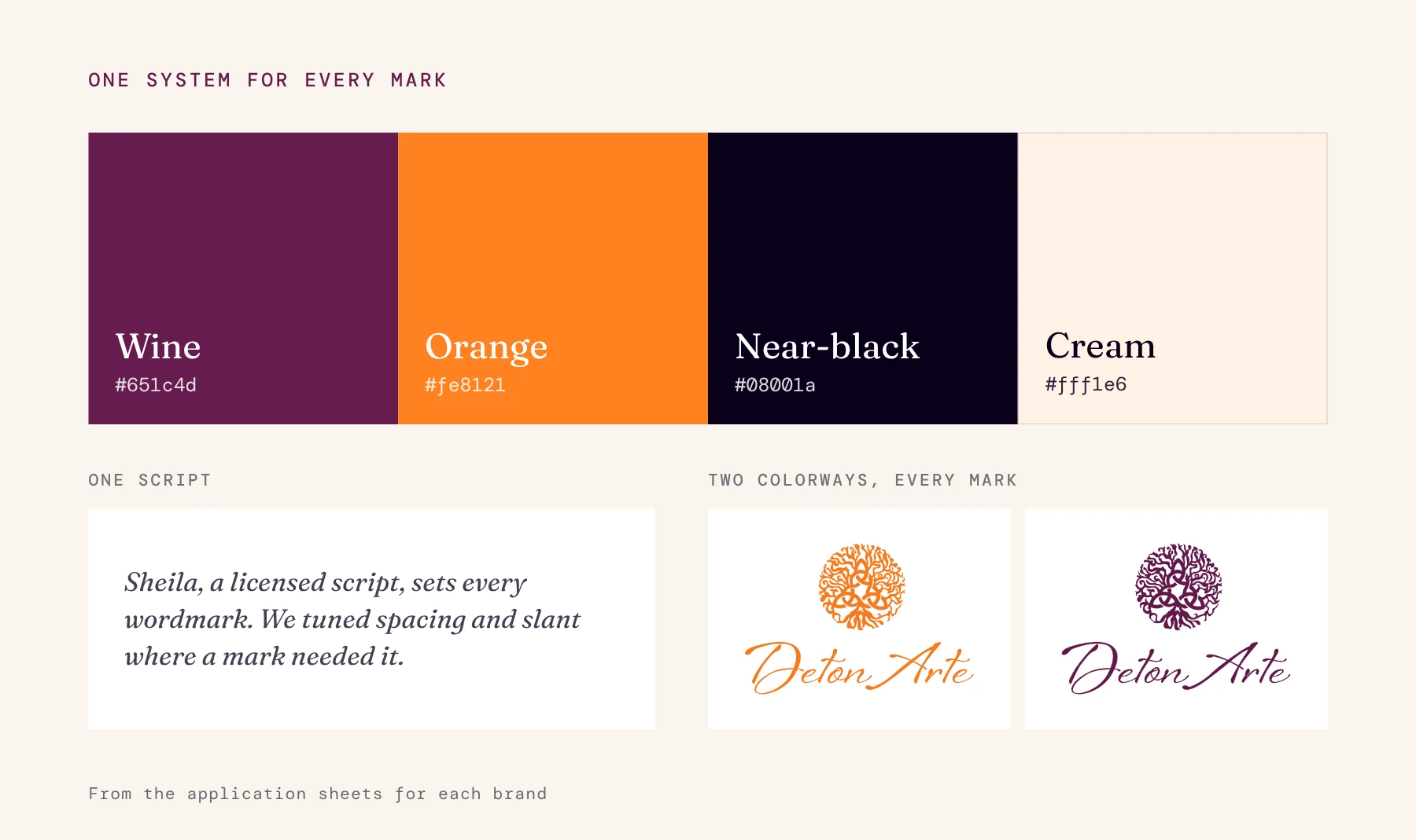
The shared palette, script and colorways.
Still in use
Carmen still uses the identity, and new pieces keep fitting into it.
The latest DetonArte poster carries the DetonArte mark, the shared palette and the small hummingbird signature.
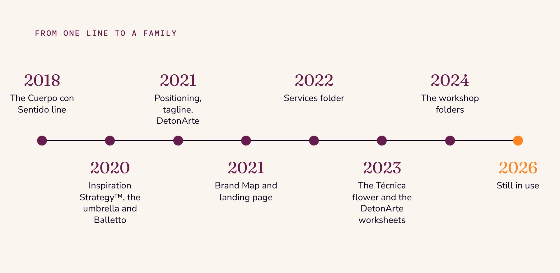
From the first line in 2018 to today.
It's being able to see it all together. All the parts come together in one whole, and I love that.
Carmen Correa, dancer, teacher and researcher · Translated from Spanish
Credits
Client
- Carmen Correa en VCarmen Correa
Project lead
- Strategy, Logos and Creative DirectionSebastián Lecona
Team
- Vectorization and PostersDipta Ghosh
- Balletto IllustrationsFrancesco Orazzini