Nilu Kamiss: A Net Made of People
Nilu Kamiss wanted to help small business owners grow their communities and create lasting change from their zone of genius. She needed an identity her community would recognize, trust and approve.

The challenge
A thriving community with no face, and a logo that arrived before the strategy did.
What we did
A strategy roadmap and an identity built around one idea, Community Net: people as circles, held together by one line.
What changed
- Nilu took three routes to her community before she decided. The mark was chosen with the people it was for.
- One reason for people to come to her, the right connections, instead of a longer list of offers.
- A strategy document she told us she came back to "all the time."
The story
A thriving group, no face
Nilu helps small business owners grow communities, mostly through Facebook groups. Her own group was alive. People interacted and supported each other.
She wanted that community to have a face. One that said what she did and who it was for.
The brand around the group wasn't there yet. Her offers kept multiplying: an academy, trainings, audits, workshops, a challenge, consulting. In her words: "I feel like I'm not delivering something that's focused enough for people to be like, oh, I want this from Nilu."
The logo came first
Most projects go strategy first, identity second. This one went the other way.
When our strategy sessions began, the logo was already underway. Nilu felt the weight of it: "I'm having to create this new identity for my community whereas I'm not really done with this whole process."
Her note to herself after one session: "hold your horses, get this done first."
So we ran both tracks. The mark kept moving, and the strategy caught up with it, until every session made the mark make more sense.

One of the color rounds, while the strategy caught up.
Three nets, one choice
We drew three routes in one shared language: people as circles, connection as a single continuous line.
The first was about togetherness: a looped line became a knot with four small heads. The second was about growth: an arrow rising through three circles. The third was about feeling empowered as a group, with an organic touch: leaves and cupped figures repeated into a mandala of people.
We put all three in the same mockups, so the choice stayed honest. And all three worked. Choosing one was hard.
So Nilu did what a community builder does. She took the three routes to her community and asked the people the brand was for.
In the end, she leaned toward the third. A net made of people, chosen with the net itself.
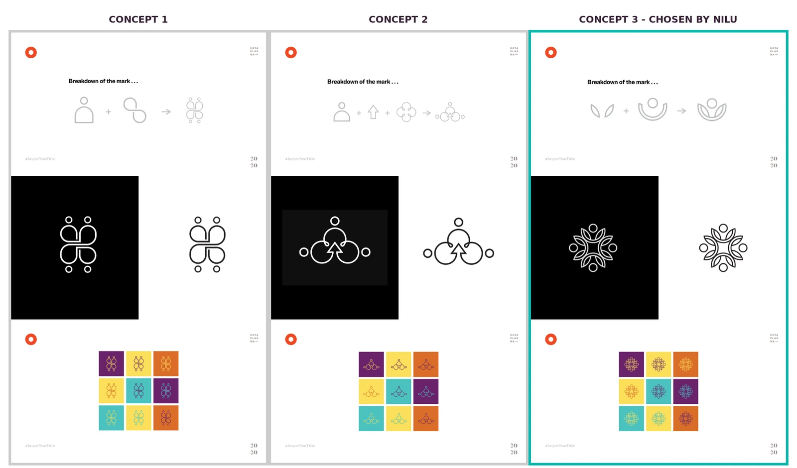
Three nets, side by side.
A coach, coached
Nilu runs a process for her own clients. This time she sat on the other side of one. Two moments changed what she could see.
Who she serves. Early on she admitted: "I think I've been too afraid to really target into my ideal persona." Once she did, a detail shaped every decision after it. Many of her people are in their 50s, and as she put it, "futuristic is more scary than empowering."
Why people come to her. That answered the question she started with. Her people didn't need a longer menu. They needed one reason to choose Nilu: she is the tech coach who actually helps you connect with the right people.
By February she had named the change herself: "I think clarity is my biggest takeaway... I come to this document all the time."
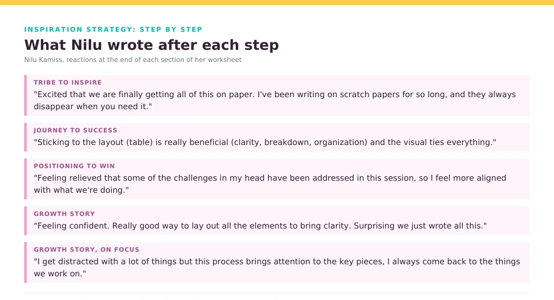
Her reactions, step by step, in her words.
The net gets its name
In our last session we defined how the brand should feel: empowered, simple yet structured. Nilu brought the idea. "I see it as sort of a safety net, you know?" She wanted structure that takes away the overwhelm.
We gave it a name. A safety net, made of your community. The mark she had chosen was already one piece of that net. We called the concept Community Net.
Her reaction: "Very cool. Yeah. I like that."
The straight lines of the net went into the layout. The circles stayed in the mark. And the colors stayed close to the pink, yellow and teal she had already made hers.
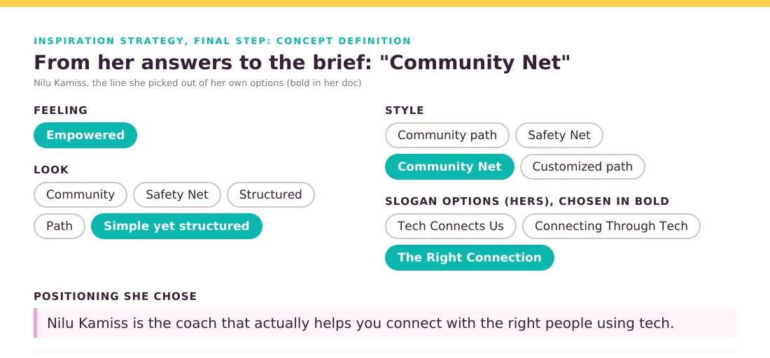
The concept page where the net got its name.
Chosen by the net
Nilu started with a thriving group and a brand that didn't say what she did. She ended with one reason for people to come to her, a strategy she kept coming back to, and a mark that showed her community as what it is: people holding each other up.
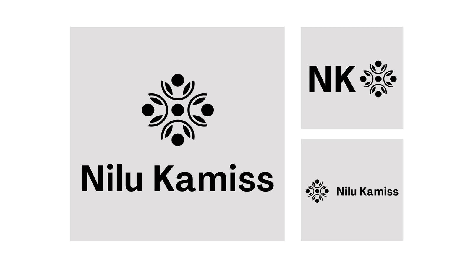
The lockups and the monogram in the final kit.
I think clarity is my biggest takeaway... I come to this document all the time.
Nilu Kamiss, founder, Nilu Kamiss
Credits
Client
- Nilu Kamiss
Project lead
- Strategy and Creative DirectionSebastián Lecona
Team
- DesignDipta Ghosh