Orquesta Mesoamericana de Mujeres: One Flower, Nine Roots
The Orquesta Mesoamericana de Mujeres (OMM) set out to be the first regional symphony orchestra and choir made only of women: 150 musicians from nine countries. They needed the region to see them, and a brand strong enough for a project built by many hands.
The challenge
A nine-country orchestra built by many hands, with a cause and a launch date but no brand to share.
What we did
One idea everybody could build from: a strategy, a logo chosen from three concepts, and an identity and content system built for a team spread across borders.
What changed
- The strategy side and the design side worked from one brief, with us translating in the middle, so the designer never had to guess.
- One source for everyone who would write, design and post for the orchestra, in any of the nine countries.
The story
One hundred and fifty women and no face
Something new was about to happen in music.
A symphony orchestra and a regional choir made only of women, with musicians from Mexico, Central America and the Caribbean. 150 of them. Nine countries. It grew from the Alaíde Foppa orchestra, founded in Guatemala in 2015, and it set out to be a first.
It had a cause, a premiere date and a team. It did not have a brand. No logo, no shared voice, no guide for the people who would write, design and post for it across the region.
And the people building it spoke two languages. The business side knew the cause, the audience and the deadline. The creative side knew how to make people feel it. Someone had to make the idea clear enough that everybody could build the same thing.
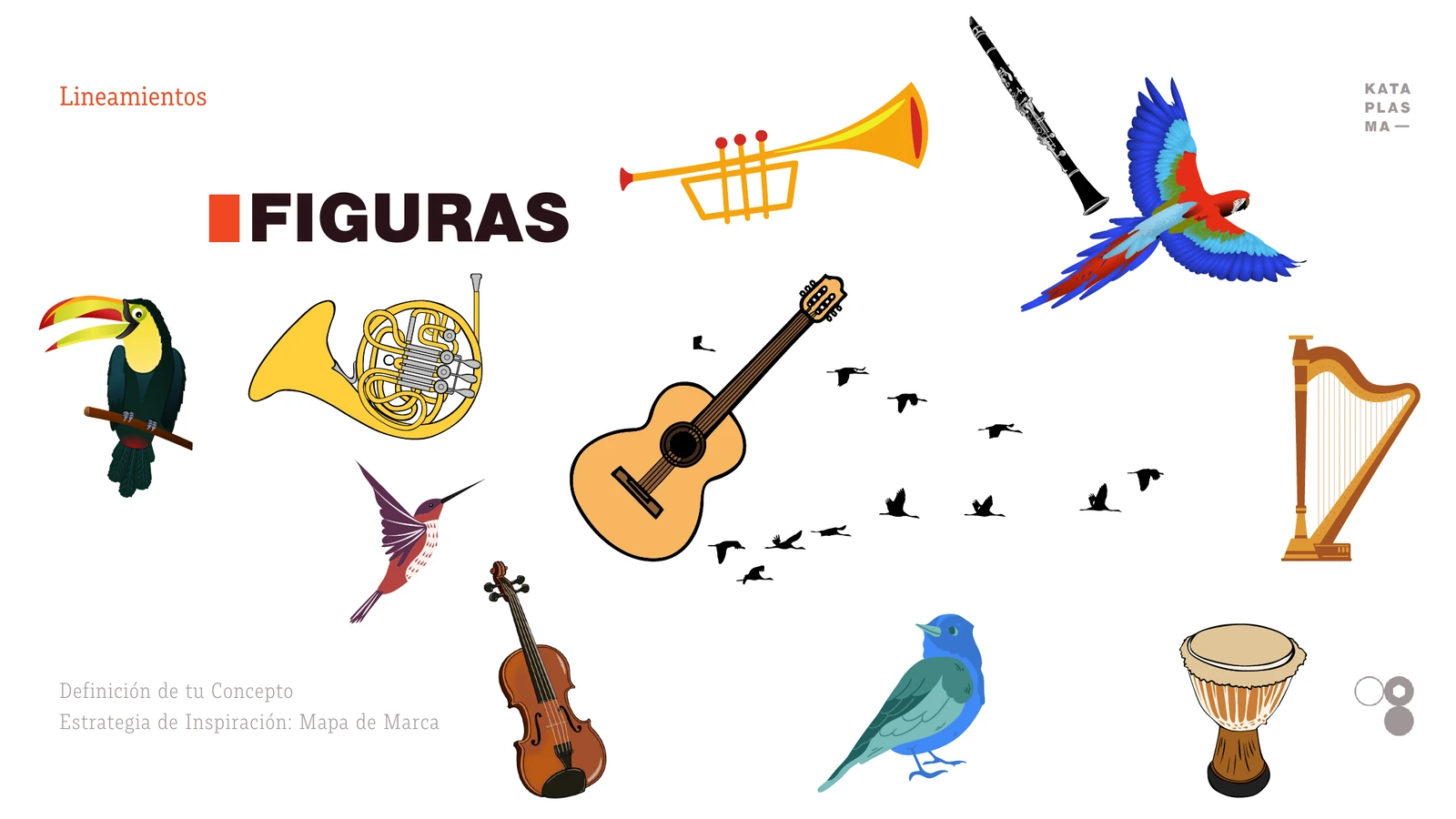
The first figures of a brand that had no face yet.
The cause before the look
Before anyone talked about color, we asked why the orchestra should exist. The OMM team answered live, on screen, through the Inspiration Strategy™ worksheets. Three answers shaped everything that came after.
The cause. Why does this orchestra exist beyond the music? Their answer: to start a conversation about the situation of women in Mesoamerica, and to open opportunities that build a shared identity through collaboration and the recognition of what women can do.
The position. A powerful and gentle voice. A leader who feels, not only commands. Their line: Diversas raíces, una sola flor. Diverse roots, one flower.
The story. Every story needs an enemy. Theirs was the status quo: the same models, the same prejudices, the same lack of examples to follow. The orchestra became the guide, with a promise to every woman: Unidas somos imparables. Together we are unstoppable.
Every one of those answers became a design decision.
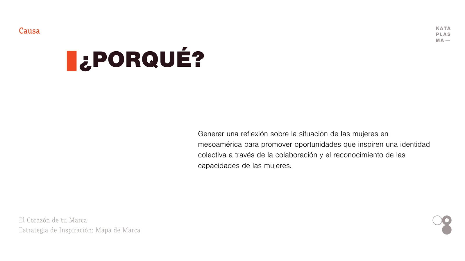
The cause, written before any color.
"El gordo"
Before any sketch, we wrote the objective in one sentence and put it on top of every concept:
Our logo must help the women of our community feel MOTIVATED with a POWERFUL and MODERN look.
From that sentence, Marybel Iriondo drew nine routes for the first round, from a bold wordmark to a cut-out emblem. Three moved forward. The one that won was the simplest: a solid circle and three heavy M shapes. We called it "el gordo." The heavy one.
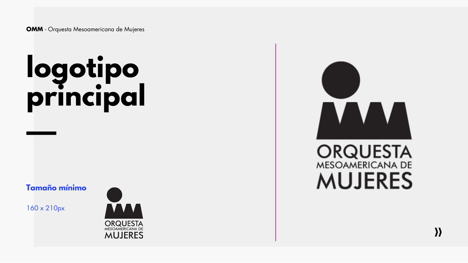
In the final logo the circle sits above the three M's, like one woman standing in front of her ensemble. One figure. Many voices.
The system took its rules from the cause. Women, birds and instruments became the illustration language, always shown together. And one rule protects the message: pink and red appear only on calls to action, never in text.
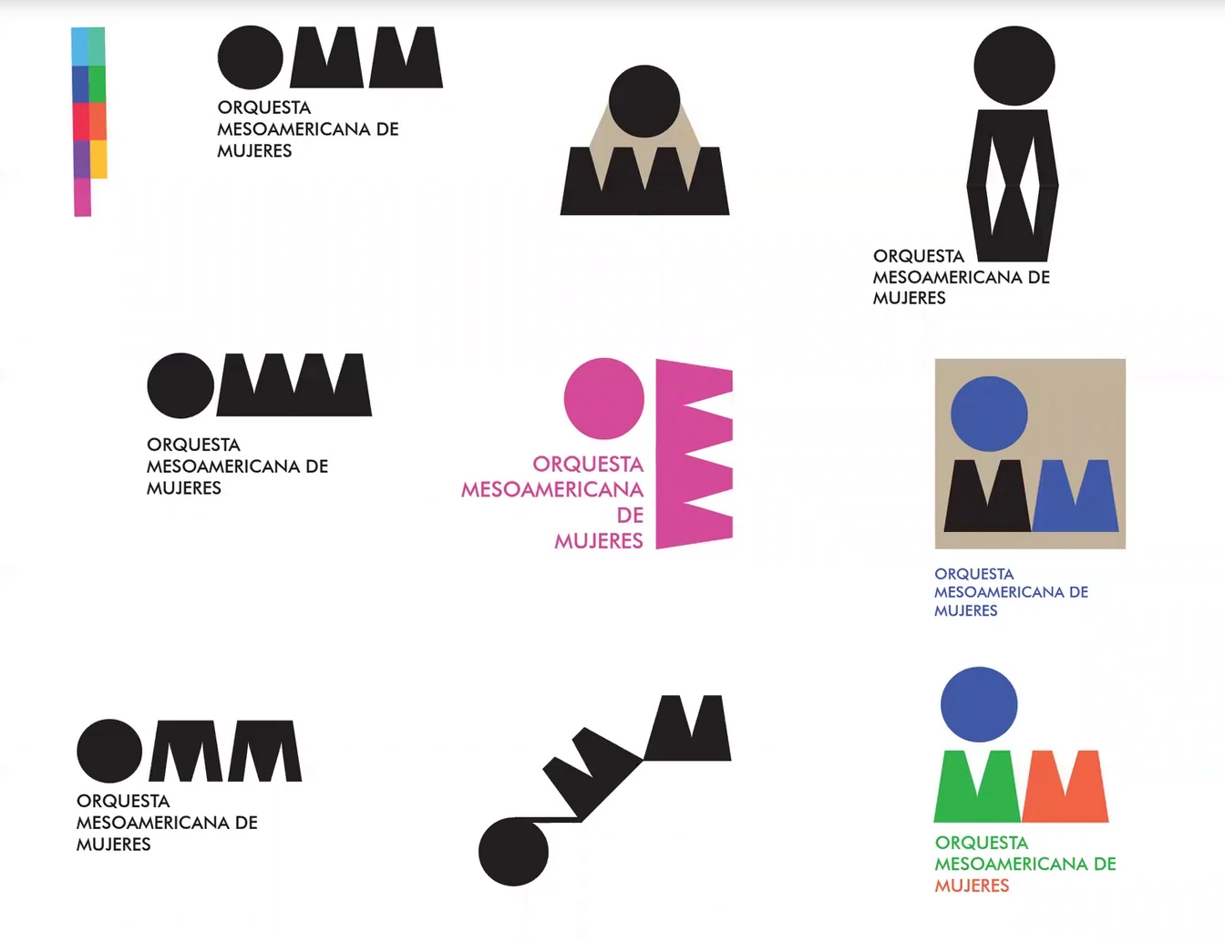
Marybel's nine routes, first round.
The translator in the middle
This is the part of the project we love to tell.
A brand like this needs two kinds of people, and they rarely speak the same language. When they don't, both lose time.
We stood in the middle.
We took the strategy and the creative direction. Marybel Iriondo, the project's designer, took the design, and she made almost all of it. Our job was to make her work easier and the client's work clearer.
- We turned what the team needed into clear design requests, so Marybel never had to guess.
- We prepared the Brand Map. Marybel designed the identity and the style guide, so every country would work from the same source.
- Daniel, the community manager and content editor, kept content moving between the team and the design.
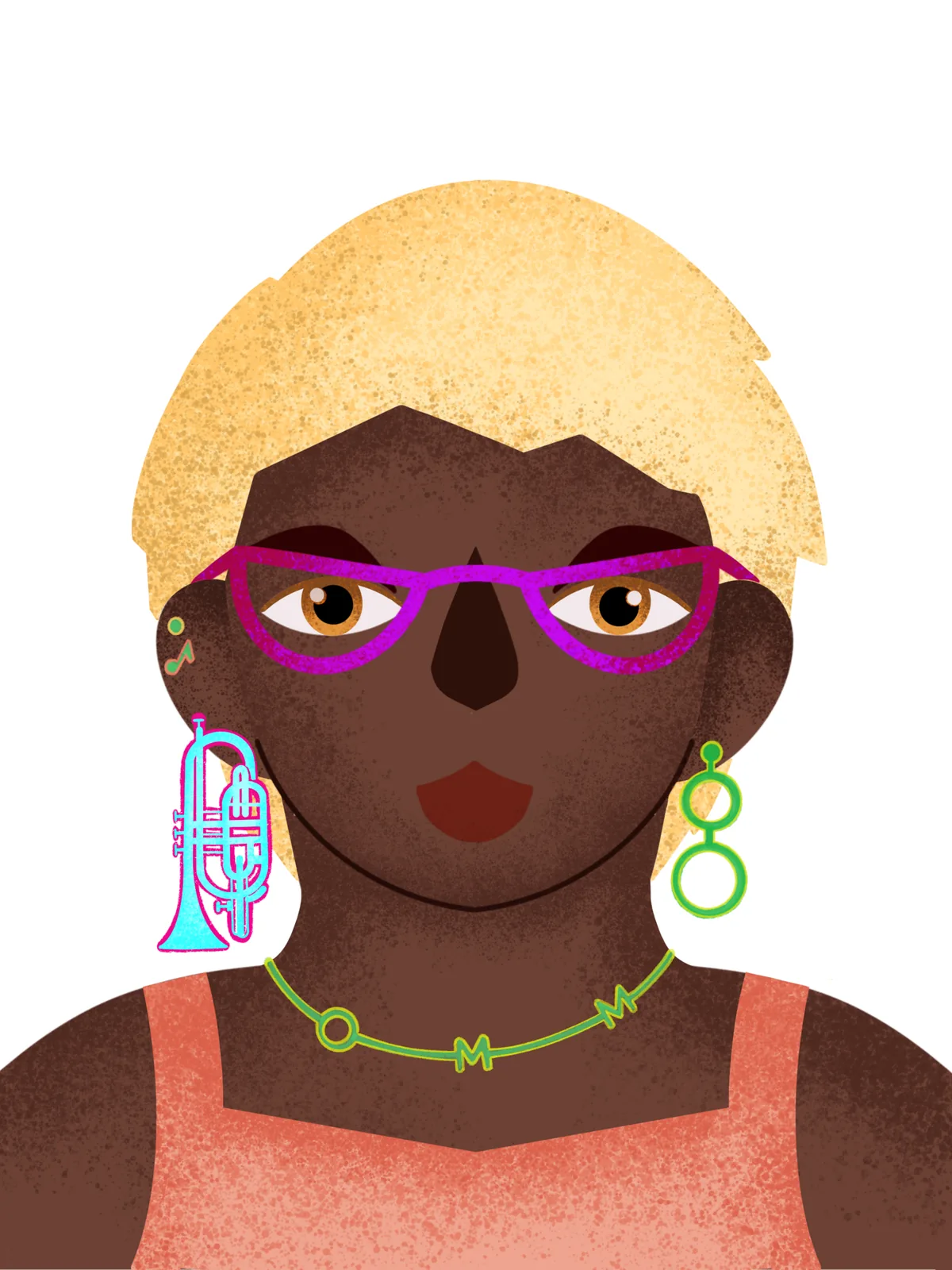
One of Marybel's illustrations for the brand.
Built to travel
A brand for nine countries has to work when we are not in the room. So we built a system, not a file: the strategy, the identity in every format the team would need, a press kit that tells the orchestra's story, content pillars, copy lines and reel scripts, and a launch checklist with every task, owner and deadline in one place.
The OMM began with a cause and a date. It now had one face, ready for every country: a logo that reads as a woman in front of her ensemble, an illustration language of women, birds and instruments, and a voice both powerful and gentle.
Nine roots. One flower.
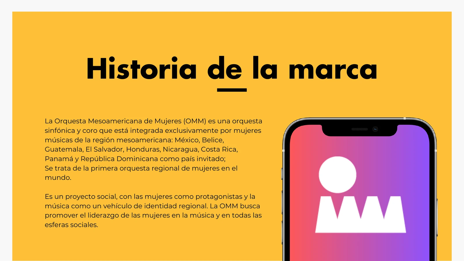
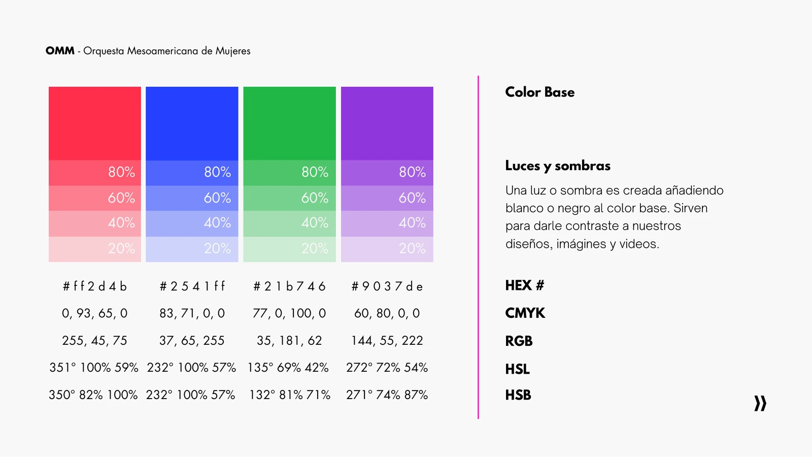
The system on a phone, ready for every country. The palette that travels with the brand.
At 75, I never thought I'd master the digital world, but Sebastian patiently walked me through creating a strategy that not only made sense but also brought my ideas to life.
Julio Solórzano, Producer, Orquesta Mesoamericana de Mujeres
Credits
Client
- Orquesta Mesoamericana de Mujeres
Project lead
- Strategy and Creative DirectionSebastián Lecona
Team
- DesignMarybel Iriondo
- Community Management and Content EditingDaniel